Tuesday, 30 November 2010

Analysis of Title Sequence - Panic Room

In order to gain some more ideas for my Thriller/Horror title sequence, I have done some research. Contrasting with title sequences as "Snatch" and "Seven", which convey the audience what the movie will be about and introduce the main characters as in "Snatch", the sequence in "Panic Room" does not reveal anything about the context of the movie. We are only showed the setting of the film, which is New York (the whole sequence contains extreme long shots of skyscrapers), the title of the movie, names of the lead actors, editors and producers. The music is the only signifier that conveys the audience that the movie is going to be a thriller because it is rather mysterious, dramatic and tensive. In the following link you can watch the sequence on youtube:


In addition, while watching different title sequences, I have found out that Soul Bass who is an American graphic designer and worked for some of the best filmmakers as Alfred Hitchcock and Martin Scorsese. He is the creater of the title sequence of "Psycho" and "The Man With The Golden Arm". He has influenced the next generation graphic designers who has used his ideas in order to create new innovative techniques, but based on his methods. Kyle Cooper's work is often compared to Bass'. He created the title sequences for "Seven", "Spiderman 2", "Across The Universe" and more.

Saul Bass - "Vertigo"                                        Kyle Cooper - "Seven"


My Horror Thriller Improved Idea

I realised that my previous idea for a thriller included too many shots and it would be impossible to contain so much infomation within two minutes title sequence. Therefore I have decided to change it, but to keep the main idea. The following power-point presentation represents my new idea:

Monday, 22 November 2010

My Practical Production Thriller/ Horror First Idea

I think that my sequence should start with a few seconds of darkness, but some noises in the background, then you hear a noise of  somebody lighting a candle and then a long shot and close-ups of the flat of circa thirty years old man. The music should be sinister and mysterious. It will be dark and there would not be very much in the room/flat (no furniture except from a table and a chair).
You can see on every wall pictures of a beautiful teenage girl. There is just one empty spot on the wall which is meant to be for the last pictures of the girl. Then he goes to another room, in his basement, which is very small and there you can see how he prepares a coffin or just a really small box in which you can see an old porcelain doll, you can also notice (close ups) some chains and a knife outside the box/coffin. The light is very spare and it the room is really dark. Nobody would be able to hear her screaming (his flat is in the middle of the nowhere like in Scream?).
Then he goes out and takes the last pictures of her. He knows that she takes out her dog every evening in the woods. The dog runs away and she goes after him and in the same time, the man comes from behind and shuts her mouth, the sequence ends like that (fading sound and then darkness or a sudden cut?). There could also be cross-cutting between her going out with the dog and him cutting the photos in order to gain time.

Friday, 19 November 2010

My MoodBoard

The pictures below are some examples of things that scare me!
I am scared of fogs because it is used very often to create suspense in horror movies. The reason is that you cannot see what is happening behind you and in front, especially if the fog is very thick. It is often used in order to create tension and mystery e.g. fog in a park where you can see somebody walking alone. The audience does not know what to expect!


I am really scared of mental hospitals and hospitals in general. People's fist association is death, old and ill people, blood and sadness. Characters with mental problems are often used in the horror genre because they look very creepy and could act unexpectedly. Normally their representation is overrated (representation of crisis, actions).


I am scared of tortures in general because it causes enormous pain. The audience usually is meant to feel sympathy with the victim. I do not like to watch movies with tortures because lately the special effects are so real that at some point you start to believe that the victim is in pain. I also have claustrophobia and small places are often used in order to scare the victim.


 I am also scared of paranormal activities. When I was still a little child and if happened that I am alone in the flat at the evening, I used to be scared if I hear noises etc. I think many people are scared of paranormal activities because you never know if it is caused from your imagination or reality. In addition, we do not know what happens after we have died and this is a mystery, which we will never find unless we die. So, our mind tries to find explanation, however it is impossible to be absolutely sure.


I think that many people find dolls scary, especially marionnetes. They are also very often used in horror movies. I think that only one doll would not be a problem, but if they are so many as in the picture, they often have a very creepy smile and could be moved. I guess that people find them scary because in conjuction with a dark room and mysterious non-diegetic music, the audience have the feeling that they are threat for us.
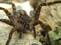
                                

I think that spiders and insects  in general are very often cause of fear, snakes etc are also included. I think that the fear aspect is used when the animals are more than one (except from snake) like with the marionnetes, when you feel it creepy because you are not sure if you can defeat them. You get the feeling that they are a big army against you. Also often used threatening factor in horror movies.


I think everybody is scared of death and therefore people create a human similar figure as the Death (wearing black clothes as in the picture, holding a scythe as a symbol of it taking your life/soul). Very often used in horror movies as well.
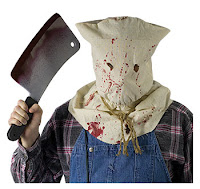


I am also scared of masks because I cannot see the person's face. Normally we are used to look while talking to somebody into his/her eyes. So when they are covered/ whole face we feel suspicious and want to reveal the face. It is again often used in horror movies.


Thursday, 18 November 2010

Denotation and Connotation of Horror Movies

Scream:

Denotation: masked person holding a knife, victim-a woman on the phone
Connotation: villain trying to scare victim, woman is supposed to be scared because he is going to kill her


Psycho:
 Denotation: woman in the shower, screaming

Connotation: scared, surprised by sb./sth.; something bad is going to happen to her - she will get killed


Gothika:
Denotation: woman looking at blood-coated wall with the words 'Not Alone', we can see her back and that she is wearing jeans and a blue sweater
Connotation: suspense, fear, she does not know who has written it, danger, maybe followed, mystery, danger


The Exorcist:
   Denotation: a monster woman, red haired, covered in scars, cuts, wears a blue pijama

  Connotation: looks like a witch, threatening look, possessed by a demon

Conventions of the Horror/Thriller

In order to explore the Horror/Thriller genre, we have watched variety of film opening sequences and compared them. We have watched the opening of Scream (1996)

     In the opening are used some of the most common horror conventions in the genre. Casie is the victim in the case and she is at home. The phone rings a couple of times and a strange man who he does not know asks her questions like which are her favourite horror movies, which was very new in the horror movies and it did not happen till then. The film is meant to mock other horror movies and therefore the horror conventions are very typical. When she starts talking about the horror movies she leans and we can see in the foreground you can see many knifes, which suggests what is going to happen and that the murderer is going to use them to kill the victim. The diegetic sounds and music are also vital for the sequence because when the mysterious man calls again and again, when you can see her fear, the ringing sound is rather ear-pearcing and louder, different than before. In addition, it is night and she lives in the middle of nowhere because there is a wide shot, to establish that you can see only fields and woods and only one car approaching (her parents). The non-diegetic music is very sinister and creepy. You can see fog. You get the feeling that somebody observes her because the camera films sometimes from outside the house (as in the pic). There is a high angle shot, when they are playing the horror movie game, to show that she is scared. When she stabs her with the knife you can hear her screaming and there are some point of view shots, to show the murderer, wearing a mask, also very typical for horror movies. Many horror movies used to start with the murder of a woman, which is typical and deliberately made like that in Scream as well.

http://www.youtube.com/watch?v=pFCStOMqpfk

We have also watched some thrillers and saw the difference between the horror.
In The Sixth Sense (1999) the mood was conveyed very differently, the pace of action and builting up to the dramatical opening (the main character's death) was very slow. However, when the woman goes downstairs to take some whine and there is a close up of her feet, suggesting something bad is going to happen. In addition, it is very cold, which signifies the fact the same. There is absolutely no music, which makes it very different in comparison to Scream. On the picture you can see that they are happy family which also makes his death more dramatical. Later in the movie, when Malcolm is with the little boy, Cole, who can talk to dead people too, to the funeral of other girl. When they have to come into her room. The suspense is portrayed by using props as puppets and marionettes and close ups of them. The little girl suddenly cathes the boy's leg and scares the audience. So, for the scary moments in the movie are used some of the typical horror conventions, but however the idea is different than in a typical horror because it is also psychological.

http://www.youtube.com/watch?v=eb5bmX9P1zs


Vanilla Sky (2001) is a psychological thriller and it is also very different from The Sixth Sense and Scream.


The opening sequence start with an arial shot, showing where the main character lives. We can hear a woman's voiceover waking him up. Later when he goes out, his car is old and when he goes out of it, he starts running because he is in a diffent time. There are used many long shots, to show the place where he is, with huge posters everywhere. So, this is a very different type of thriller, more psychological than scary.


http://www.youtube.com/watch?v=HTkf1X6RIPw&feature=related

In addition, we have brainstormed conventions of the Horror/ Thriller as:
- death; blood; gore; violence; suspence; mystery; screams; weapons; deformed monster people; victims; killer; no signal; scary subjects as spiders; chasing; mental people; torture; dead bodies; murder; pain; fear; dingy places; abondened houses; scratching; knives; twist in the plot; creepy children; paranormal; graveyards; bad omens; bats; footsteps; trees in wind; mutations; dolls; masks; blind spot; storms; ghosts; protagonist; antagonist; claustrophobia etc.

Monday, 15 November 2010

Editing - Preliminary Task

We have edited our Preliminary task sequence and have used a Program called "Final Cut". We needed to apload everything we have filmed and save it in the "rush bin". You need the rush bin in order to have backups in case something goes wrong with your editing and you can always go back and re-use the files.
We have chosen the shots we want to use and put them into the "log bin". It was important to name them properly, so you can recognise them afterwards and choose what you need e.g. "Adam wide shot". We had two screen, in the first one you could see the shot you have already got and in the other the edited part. There is a big window called  a "time line" below where you can actually edit and change the sequence and the shots. With the help of the "play head" (little yellow triangle) you can play you sequence from whereever you like. We learnt that we could expand the shot or cutting it. We have experimented with overwriting the bit of every cut, so the cut is more smooth. We have also tried to use just the sound of  a shot, but use another for the image, which also worked fine. However, I found that a little bit confusing because we had to be really careful which bit to use and when.
I have enjoyed the part where we had to decide which sequence to use and the cutting. I found a little difficult to match the shots together, so the sequence looks like a whole logical bit and not just cuts. I also liked the idea that now I know more about how the films we watch are actually edit, which is really amazing.


Below you can see a picture of the Final Cut program.


In addition, here you can watch a video of the Basic tools in Final Cut:


Tuesday, 9 November 2010

Preliminary Task Evaluation

In our film we have used a Rubik's cube, therefore we have chosen a classroom as a location for our shoot. We thought that a younger environment would fit with the dialogue between a teacher and a student who wants him to do a task. We have worked as a group and we have set up the tripod together and bubbled it to balance it. We also have checked the white contrast and the lighting. Afterwards, each of us filmed a scene from a wide shot, close up etc.

Lighting:
The light we have used was very bright because we have used two stage lights. This was important for the scene because it was supposed to be in a classroom where it is very light and we also wanted to put an emphasis on the actors faces, so we did not use natural lightning or rather dark light. The film should not be scary or sinister. It was effective because it helped us to reinforce the typical lighting in a classroom.

Filming:
We have set  the camera up correctly and checked the tripod's balance in each shot. However, we have forgotten to bubble it once which lead to doing the shot again. We have checked the framing every time and paid attention to the fact that the people are in the middle and there is no empty space in the frame. However, once we have made a mistake with the over shoulder shot, where in the shot you could see more of the shoulder than the actual person. We have also made a mistake with the focus in one of the close ups and because we had only one shot of that, afterwards when we had to edit the film, we used the unfocused one. We have used appropiate shot, according to the Storyboard, paying attention to the bits we want to emphasize like a close up of the Rubik's cube when it was slammed on the table. We have also used a wide shot to establish the location and introduce both actors. In addition, we had used close ups to show character's facial expression. We have tried to plan appropiate and use the storyboarding. However, when we had to do the editing, we find out that we have missed some lines and shots, but fortunately used other shot, so the story could fit together. We paid attention to the 180 degree rule because we have broken it the last time when we practised the preliminary task before. We have also tried to use appropiate terminology as 'rolling' and 'action'.

I have learnt how to use the camera and understood how important it is to pay attention to every aspect in the film includes as lighting, props, editing, sound and camera shots.

Storyboarding:
A storyboard is a graphic organizer. It illustrates a series of images which are displayed in a sequence. A film storyboard is a large comic of the film in order to help film directors to recognise probable problems before filming. It provides a visual image which helps the filming process. It also helps to imginne the film sequences better before they are even filmed.

The storyboard of the preliminary task: